Image Credit: Karolina Grabowska
Does a Flat or Inverted Yield Curve Still Indicate Recession?
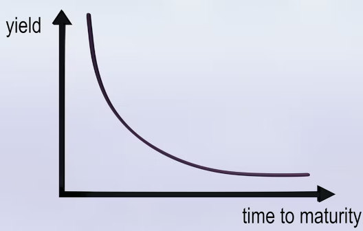
The shape of the treasury yield curve is one indicator the stock market, bond market, and real estate markets are viewing the economy with pessimism. Historically, conventional wisdom has been that if the market has priced rates lower for longer terms than shorter terms, it indicates economic weakness is expected down the road. This would include lower growth, less demand for borrowing, and at the same time, reduced inflationary pressure.
Current Interest Rates
Currently, US Treasuries maturing in one year, and those maturing in 30 years return approximately the same interest rate. The seven and ten-year terms offer rates lower than maturities, longer and shorter. This flat yield curve which is inverted in the shorter end, offers low yields across all maturities. Can we assume it means bond investors expect slowing growth, low inflation, and low inflation out for decades?
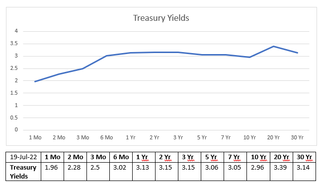
Source: US
Treasury
Current Inflation
The increase in the price for a set basket of goods as measured by the Consumer Price Index (CPI-U) data was up 1.3% for the month of June (9.1% YoY). If inflation were to remain at June’s pace for the next two months (1.3%), the three-month compounded impact would be 3.95%. Much higher than the current three-month treasury yield. In fact, it would be higher than all other yields out through 2052. This suggests the mechanisms pricing the market aren’t looking at inflation expectations in the short term and may not be evaluating the risk in the long term either. Otherwise, within the shortest periods of time (3 months), one would expect the curve to be priced in-line with the most recent inflation numbers.
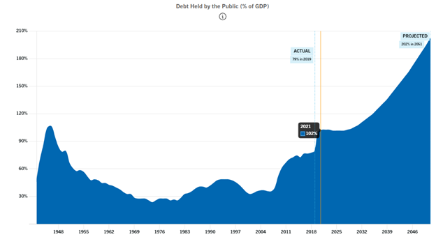
Source: Peter
G. Peterson Foundation
Using conventional wisdom, with the yield curve as a gauge, one would surmise the market expects that inflation will drop by half of the 1.3% it recorded in June over the next month. If this is true, then the short end and perhaps the long end is priced appropriately. That is until one looks at the added supply that has already been added to treasuries outstanding and that which is expected to enter the market. The increased supply, based on conventional wisdom, should increase the yields needed to sell all the bonds. That’s how supply-demand pressures work.
Unconventional Yield Curve Pricing
The yield curve as an indicator of future economic expectations may be broken.
The U.S. has amassed $30,515,000,000,000. In debt. Put another way, if every single person (not household) split this debt burden in order to pay it off tomorrow, they each would owe $91,668. This is approximately double the amount it had been ten years ago, and it is now higher than GDP. As depicted in the chart below, if you go back ten years to 2012, a period with deflationary concerns, there was a yield difference between two-year and ten-year treasuries of plus 1.25%. Today it is negative 0.19% even though there is record inflation and less ability to pay the debt. Plus all rates on the upward sloping curve were higher in 2012 than they are now. Should two-year and ten-year maturities be inverted? Should rates across the curve be lower now even though there are not the same deflationary concerns?
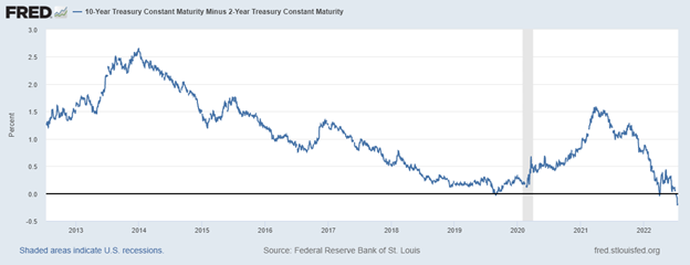
Source: St. Louis Federal Reserve Bank
What May Be Shaping the Curve
One possible answer is the (bond) market believes the US will be driven into such a deep recession that inflation drops to near zero within the next few months. There is no evidence of this in any leading indicators, including the stock market. So we’ll look to see if there is something else skewing the normal pricing mechanisms?
Since May of 2020, the Fed has been controlling interest rates along the entire curve by something they call Yield Curve Control (YCC). The chart below shows the Fed’s holding of US debt increased by $5 trillion from 2020 until today. Much of this was to manipulate the yield curve as they openly announced they would do in May 2020. It was part of their quantitative easing plan which continued into the second quarter of this year.
The Fed is now raising overnight rates quickly. A massive amount of debt in the mid and longer parts of the curve is still being held by the Fed and being unwound at a pace of less than $50 billion per month with the promise of accelerating that in pace September.
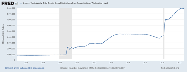
Source: St. Louis Federal Reserve Bank
It makes sense that the (bond) market reaction, which includes a flight to quality into US dollar-denominated securities, is not pushing longer rates steeply upward. Despite an annual inflation rate that is higher than it has been in 40 years (treasuries were paying 13% in 1982), the bond market is inverted and hasn’t sold off significantly. This cycle it can’t sell off too much because the largest holder, by far, is not market driven. It is the Fed and is using unconventional policy announced two years ago. So the results don’t follow convention.
Are We Headed Toward a Recession?
The yield curve is slightly inverted. A steep inversion has in the past been a reliable indicator of a recession ahead. As an indicator, today’s yield curve can be expected to be far less accurate than in the past. This is because the Federal Reserve has, up until very recently, been buying treasuries to stimulate the economy and help shape the yield curve. The lowest part of the curve, one year and longer, is the 10-year Treasury note. This is the rate that 30-year mortgages are spread off of; should that rise too quickly, the housing market may fall at an uncomfortable pace.
The economy may very well be in a recession or enter one in the coming months. If it does, the current signs of this happening are less likely to be found in the yield curve than at any other time in US history.
Managing Editor, Channelchek
Suggested Content
 The Yield Curve as a Leading Indicator Has Been Compromised
|
 The Detrimental Impact of Fed Policy on Savers
|
 How Much is a Trillion?
|
 Yield Curve Control, Stock Prices, and Trust (June 2020)
|
Sources
https://fiscaldata.treasury.gov/datasets/debt-to-the-penny/debt-to-the-penny
https://fred.stlouisfed.org/series/T10Y2Y
https://research.stlouisfed.org/
Stay up to date. Follow us:

|